
Roadside Whim + the Making of Route 66
— a peek behind this signature pattern.

the spark
In any collection there’s a moment where a motif pulls me off the main road and into some unexpected side trail. For this one, it was the Route 66 sign—an icon so overfamiliar that peaked mundanity and looped back to oddly charming again. Now the usual Americana nostalgia just isn’t resonating these days, so like most bits of inspo I turned to soft-escapism and a sense of whim.
Take a little detour, add a pastel wink, and we have a novelty print that knows exactly what it’s doing.
I approached it as a piece of roadside whimsy, rather than a retro throwback. More fantasy detour rather than historical reference. The design started with that reframing—soft escapism, pastel clarity, and a spark of novelty that doesn’t rely on nostalgia to land. This print isn’t about the road. It’s about the unexpected delight of taking the long way.
If you want to see the interior world this pattern lives in, I built a separate styling lookbook. You can explore that here.

from sketch to pattern
What drew me in wasn’t the mythology around the road; it was the shape. The shield. The way its silhouette has quietly shifted across decades and across countries—always familiar, never identical. That small observation became the heart of the pattern. Instead of chasing one “perfect” Route 66 outline, I leaned into variation: softened curves, altered proportions, tiny eccentricities reminiscent of old highway archives or paper ephemera gathered from international flea markets.
The early sketches were simple—repeated explorations of the shield in its many possible forms. But once I let myself explore translation (cultural, visual, temporal), the variations multiplied. The usual boldness of a road sign softened into something more collectible and charming: rounded edges, gentled contours, a cleaner graphic presence that still held its identity.
The repeat sits in that sweet spot between orderly and lively—enough structure for upholstery, enough playfulness for small goods. I also built in multiple scale tests to ensure it works on large surfaces, tight repeats, dimensional objects, and soft goods with movement.
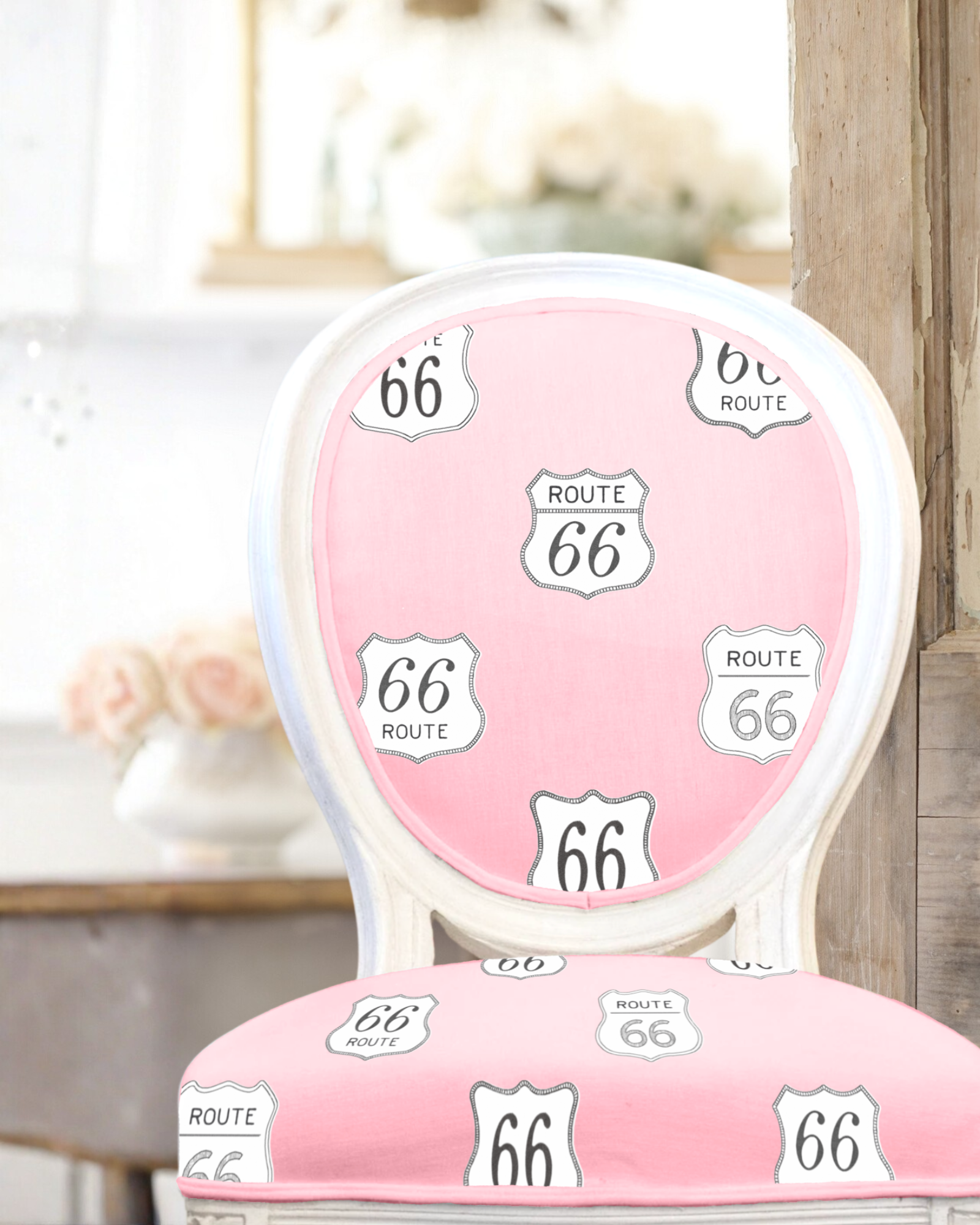
up close - texture + tone
The palette started with a taffy-pink ground, crisp and bright enough to carry the motif without overpowering it. The white sits clean against it—fresh, intentional, and a little bit cheeky. I kept the linen texture visible because this design benefits from feeling grounded; novelty prints often risk going flat, and the linen gives it the same tactile warmth as my botanical work.
Most of the charm comes from the printing logic: I designed the motif as a two-layer print, slightly off-register. Just enough “wobble” to mimic the character of hand-aligned screen prints without forcing imperfection for its own sake. It’s subtle, but it makes the whole pattern feel lived-in, like something that could’ve been pulled from a roadside souvenir shop in an alternate pastel universe.
That off-register double-layer became the signature detail that ties it all together, keeping that hand-drawn charm alive.
A pastel interior-style collage featuring blue chinoiserie wall panels, a bamboo-framed floral artwork, a rippled ceramic vase with rolled papers, and a pink Route 66 upholstered chair. To the right is a pale grey vintage writing desk with pink flowers in a white vase and cane storage boxes beneath. Three patterned pillows sit at the bottom right. The palette is soft blues, pinks, creams, and natural textures.
why it’s perfect for licensing
Route 66 succeeds because it sits at the intersection of charm, clarity, and market flexibility. Novelty prints can be temperamental—they either dominate too aggressively or dissolve into kitsch—but this one lands in that rare middle lane. It’s cheeky without being childish, offering a dose of novelty wrapped in sophistication. A little absurd, but intentionally so. It’s the kind of print art directors love: able to swing cute and polished without losing its shape.
The pastel palette widens its market. The taffy pink and white pairing brightens the motif just enough to read clean, upscale, and décor-ready rather than niche or nostalgic. And because the shield variations and softened silhouettes are built with clarity in mind, the design scales beautifully—small enough for pouches and textile accessories, large enough for statement chairs or wallpaper panels. Upholstery, wallpaper, soft goods, small décor objects, stationery, giftables—it travels easily across categories. And when it’s styled within airy pastels and vintage-leaning interiors (as shown in the lookbook collage), it holds its own without shouting. It slips easily into elevated spaces, which is unusual for a novelty motif. The charm is there without relying on retro sentiment.
What makes it work isn’t just the sign itself—it’s the translation, the rhythm of repeated shapes, and the slight off-register alignment that keep the pattern feeling roomy, lighthearted, and modern.
part of a growing collection
This signature pattern is just one of my novelty prints stemming from an ongoing body of work, exploring roads less wandered.
Brimming with pastel-bright motifs and ideas for new colorways, this collection is ever-growing – coordinating stripes, simpler dots, and soft blender patterns. I find the key to any upholstery-friendly capsule collection is a balanced yet eclectic assortment of prints that mix and match effortlessly. That and a strong anchor so each facet orbits that same soft-escapism ethos.
For more pastel hues, wandering symbols, and the delight of stumbling across something charming where you least expect it.. More Scenic Route designs are on the way.
If you’d like to explore the décor world this print lives in, explore the Route 66 styling lookbook here. It dives into that side of the project—maximalist pastels, vintage French silhouettes, chinoiserie softness, and all the eclectic touches that make this motif feel at home.
For licensing inquiries, collaborations, or custom pattern development, contact: contact@houseofpops.art