
Cheers + Celebrate!
a closer look at this playful collection.
Let’s toast to the simple things—the tiny, ordinary moments that somehow make life sparkle. A spontaneous picnic, a just-because dinner, a slice of cake on an ordinary Tuesday. Gen Z has turned everyday joy into an art form, and that energy is the heart of this collection.

Celebrate draws from that blend of joyful maximalism and thrifted-dinner-party charm: mismatched wine glasses found secondhand, well-worn table linens, simple candles elevated by repurposed jars. It’s about gatherings that don’t wait for a milestone—moments that treat something simple as something special.
Featuring swirling pastels, hand-drawn glassware, and soft confetti motifs, the patterns feel playful yet grounded. Style them simply or layer for a more expressive look—the designs stay easy, charming, and versatile. And that versatility carries over commercially, too: the collection holds its own on a boutique shelf or a big-box endcap.

about the collection :
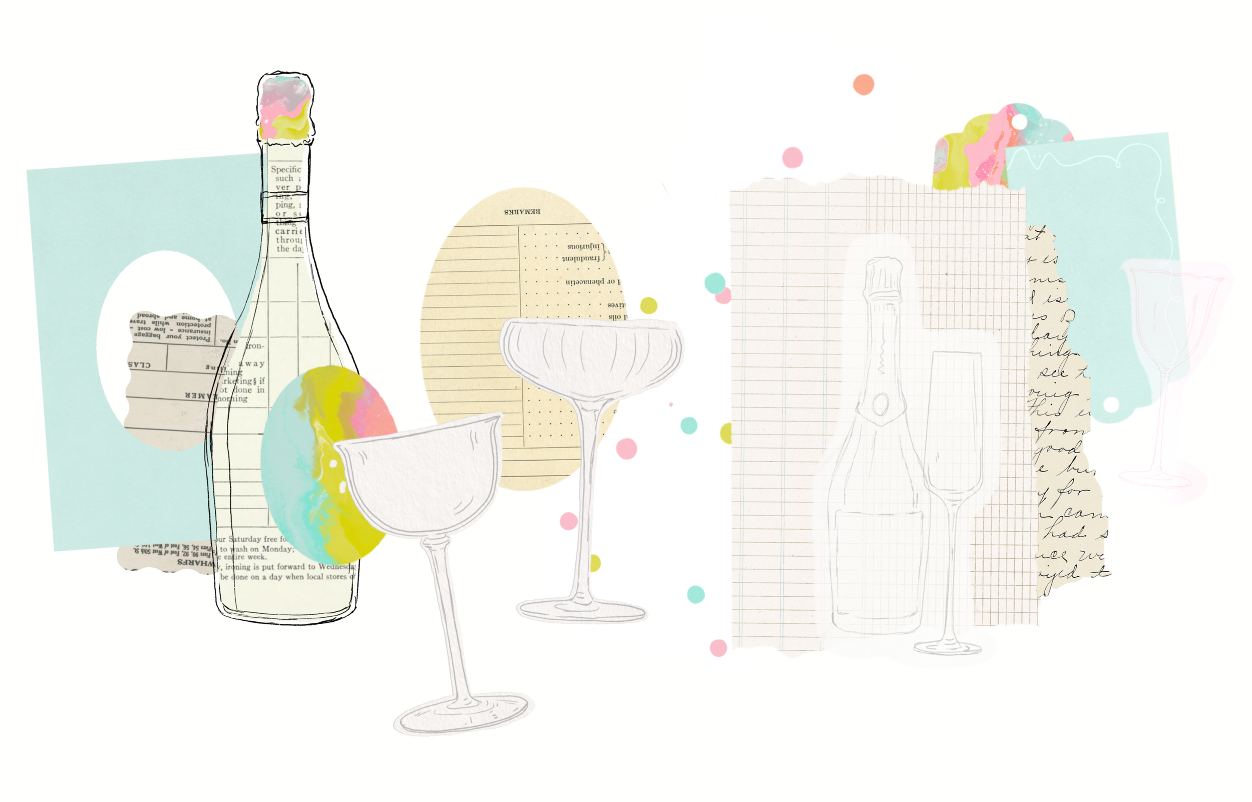
The entire collection is anchored by a signature marbled texture—swirls of taffy pink, citron, mint aqua, and warm neutrals. This marbling acts as the "hero" visual: expressive but controlled, vibrant without being loud. Bright taffy-pink and citron swirls that look like melted sherbet in motion.
The palette is intentionally light and buoyant—nothing muted, nothing stuffy. It's built for the celebratory moments people actually shop for, with a full cast of supporting prints designed for real-world versatility: confetti scatter, soft stripe, micro-dots, loose linear squiggles, and tone-on-tone textures.
But here's what keeps it from floating away: a hint of ephemera. Vintage ledger paper, found botanical scraps, dusty vintage neutrals that give the whole palette something to lean against. This grounding layer adds depth without heaviness and shifts the modern, editorial tones to something a bit more imperfect, human, lived-in.


the signature element

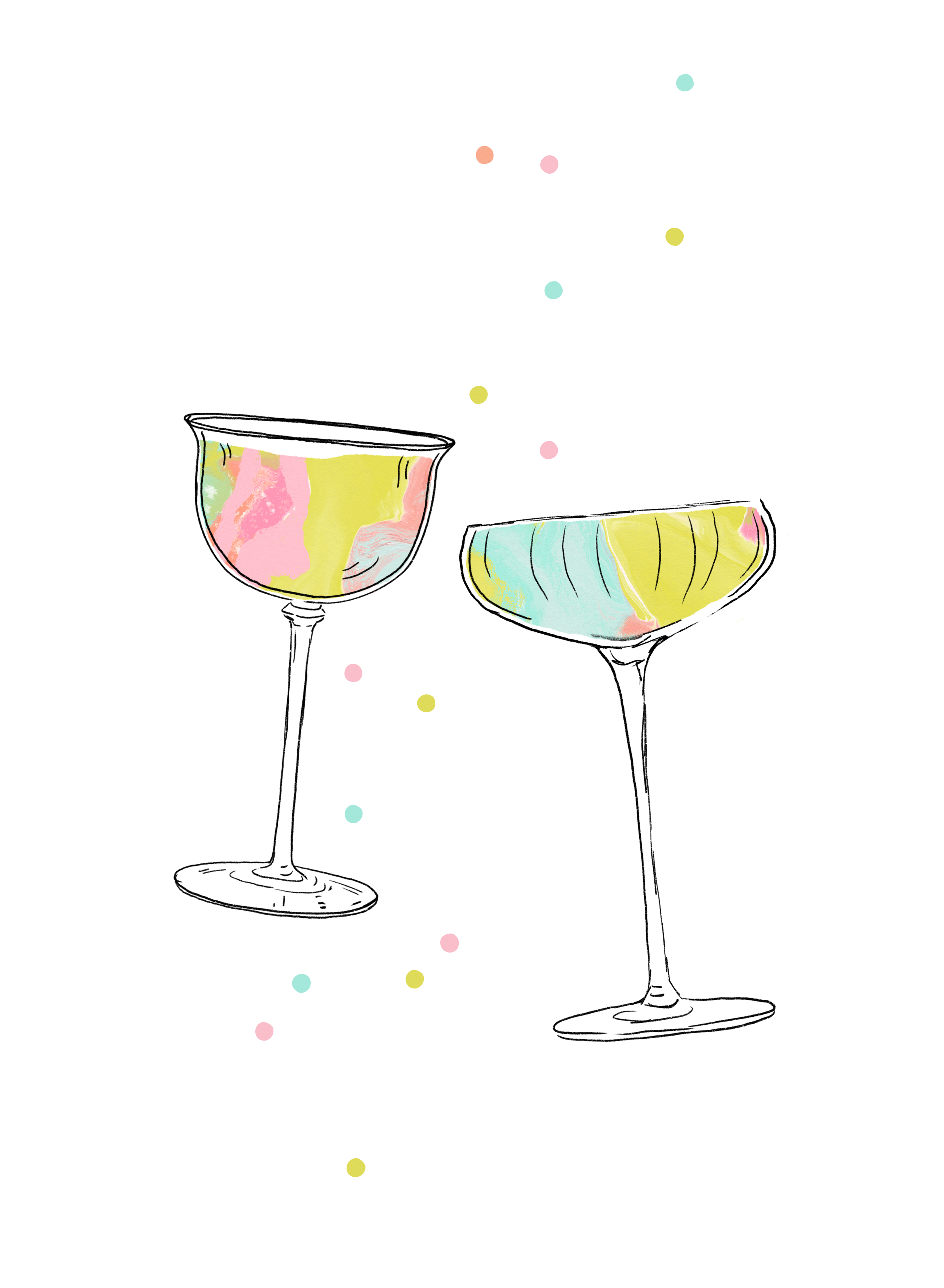
The coupe glasses are the through-line. Their shape—clean, minimal, slightly flirtatious—makes everything feel intentional without getting stiff. They're the balance point between whimsy and restraint, and they let the brights breathe.
The hand-drawn elements give the line its recognizable signature. They're elegant, minimal, and slightly whimsical—commercially friendly without drifting into generic. Whether they appear on cocktail napkins, greeting cards, gift bags, or tags, they read as boutique but accessible. These linework elements help the collection feel cohesive across formats.
The glassware drawings are what tie it all together. They're elegant but not serious, drawn the way you'd sketch something you really enjoy looking at. They give the colors a place to land, and they keep the whole collection from dissolving into pure sweetness. There's always a line, an edge, a bit of structure holding the brightness in place.

building the compositions
The collages are designed to feel airy and joyful, with a touch of whimsy. Even as I layered more into each piece, the collection stayed soft and open. That vintage-paper overlay I mentioned earlier—ledger sheets, botanical sketches, soft collage moments—really comes through here. It adds contrast to the bright palette and an elevated, editorial quality. It's a nod to tactile nostalgia, something with heart behind the gloss.
where it lives
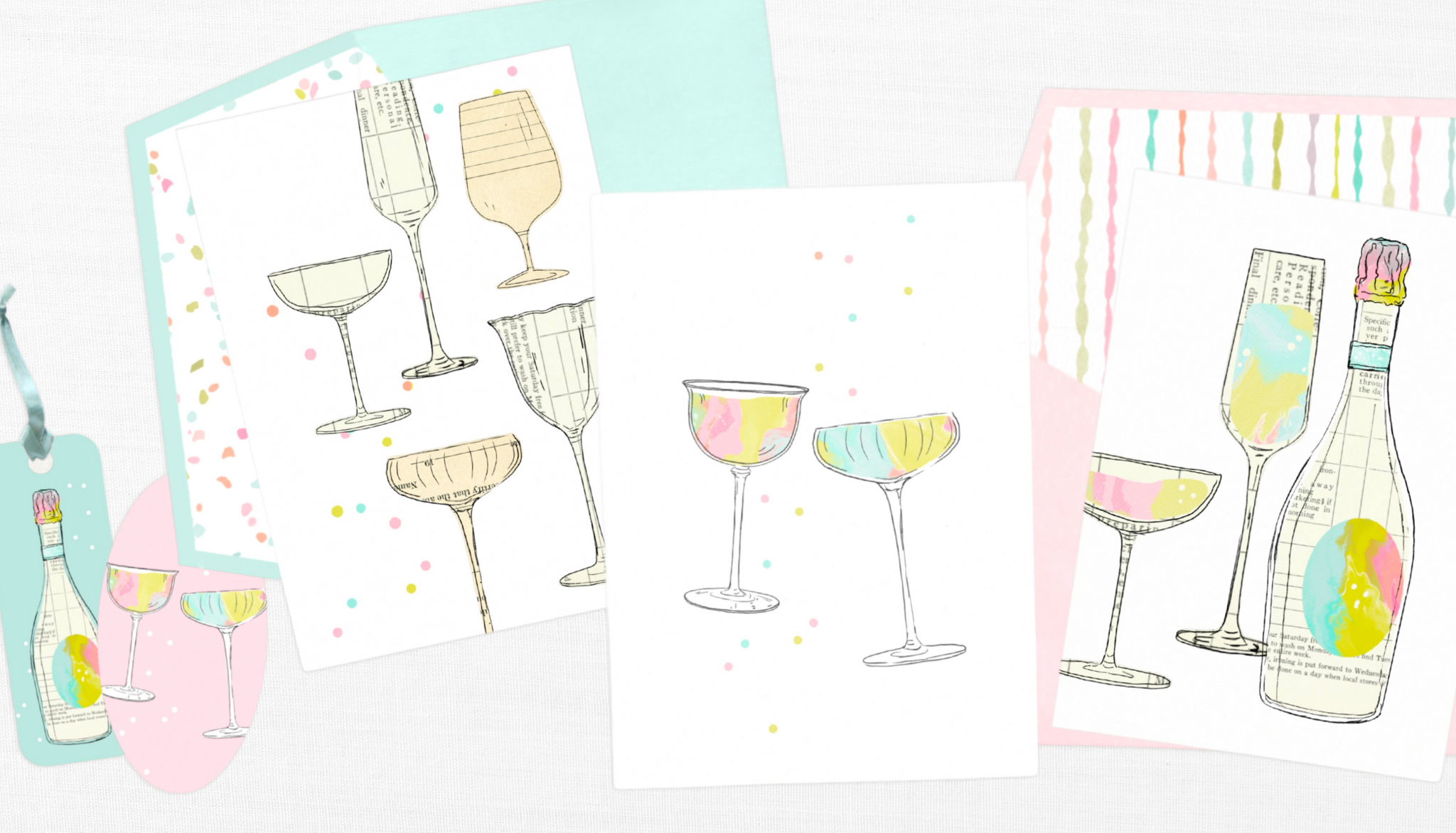
What I love most is how easily these pieces start imagining themselves as products. The collection's structure is built to flex: marbling for impact, blenders for usability, glassware for signature storytelling.
This is a commercial line designed for stationery, gift wrap, party décor, and spring/summer product assortments—playful enough for a boutique, polished enough for major retail. Perfect for paper goods, tabletop, textiles, small gifts, and boutique lifestyle products. It works for brands that want to feel fancy and fun without taking themselves too seriously.

let’s collaborate!
This collection was a joy to build. It feels bright, modern, and unmistakably mine—yet polished and versatile enough for the commercial world it's meant for. If you're a licensing partner, art director, or brand interested in collaborating on a celebratory product line, I'd love to connect.
These designs are available for licensing, and I'm also happy to develop collection extensions—custom colorways, adapted motifs, or new pieces in this style. If something sparks an idea, let's talk.